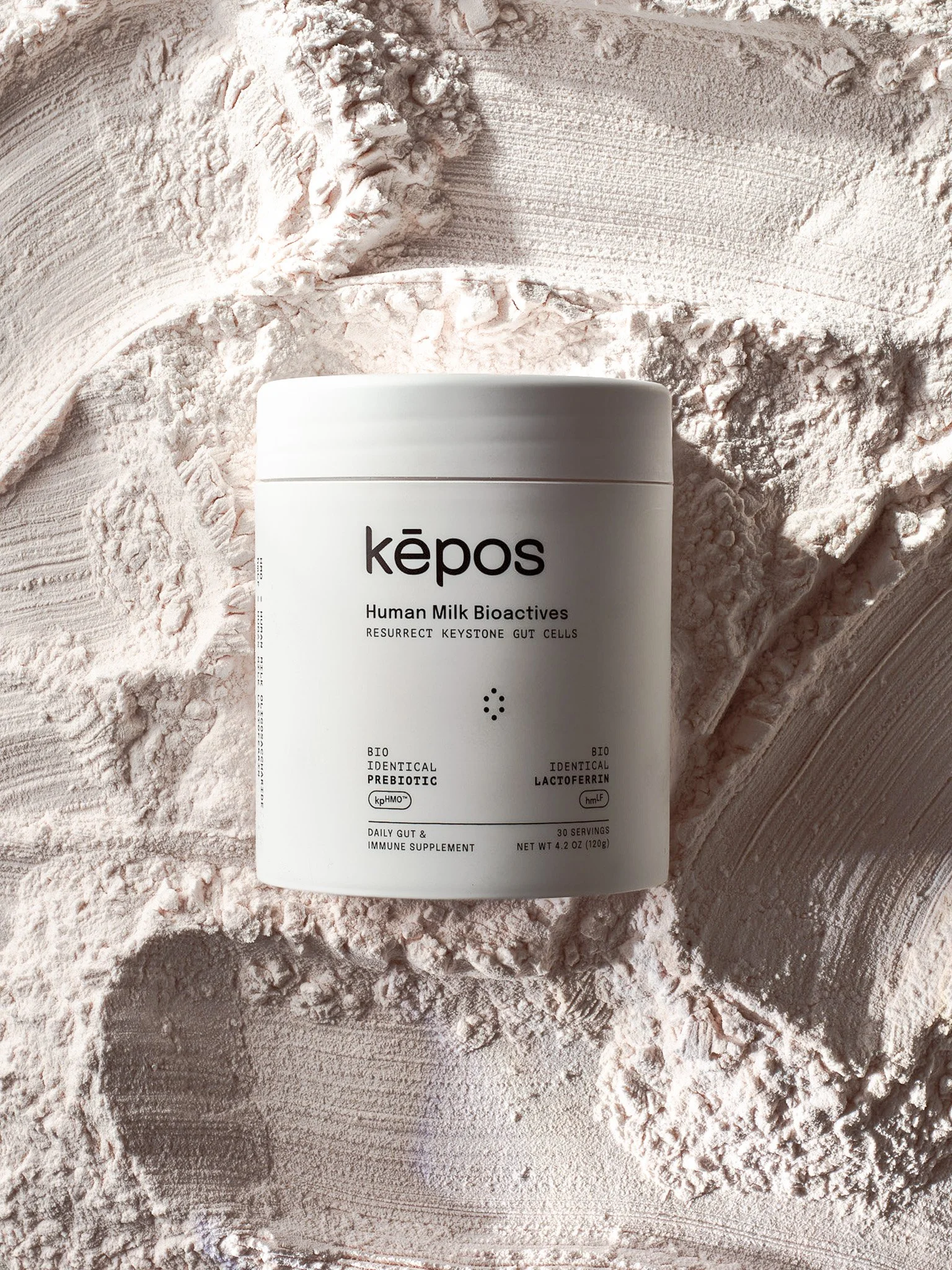
kēpos was at a pivotal (in a good way) moment and needed to be refreshed from all angles. Our work quickly became holistic in approach, creating a world in which kēpos is thee first of it’s kind nutrition — revolutionizing human milk and educating consumers at every touchpoint of the brand. For this project the scientific delicacy and efficacy was crucial, so visually the brand is technical and precise. Along with a tech-forward feel,human health is at it’s core so it was imperative the visual language be human and soft as well. With ongoing testing and data the brand has seen continued growth from day one and increased conversion rates overall.trykepos.com
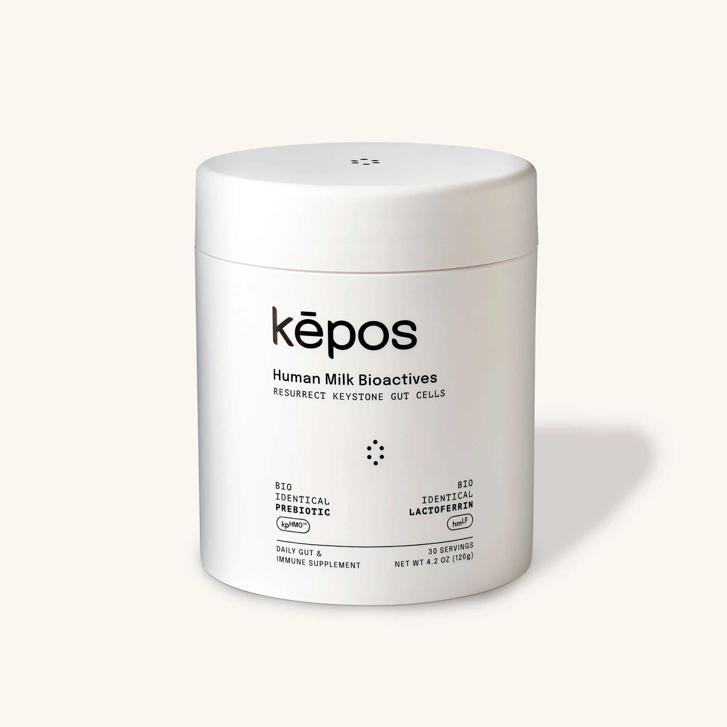
White container of Kepos human milk-alternative superfood with black text and logo, with circular graphic indicating human milk ingredients around it. Kepos Brand design
Close-up of soap bubbles with thin transparent walls, showing various sizes of bubbles interconnected and floating in a soapy solution. kepos brand design
Close-up of white granular salt crystals scattered on a surface.
A grayscale photo of a person with a shaved head, eyes closed, and hands clasped, with water splashing on their face, next to a swirl of blue and white marbled water. kepos human milk equivalent kepos brand design
A grid of nine minimalist icons representing various technical or technological functions, arranged in three rows and three columns.kepos human milk equivalent kepos brand design
Text on a light blue background explaining kefir as a superfood for gut health, with certification badges at the bottom. kepos human milk equivalent kepos brand design
Infographic explaining how iron in food helps fight bad bacteria by sequestering and transporting iron in the body, including steps involving bacteria, iron sequestration, and human milk lactose, with icons representing each step. kepos design
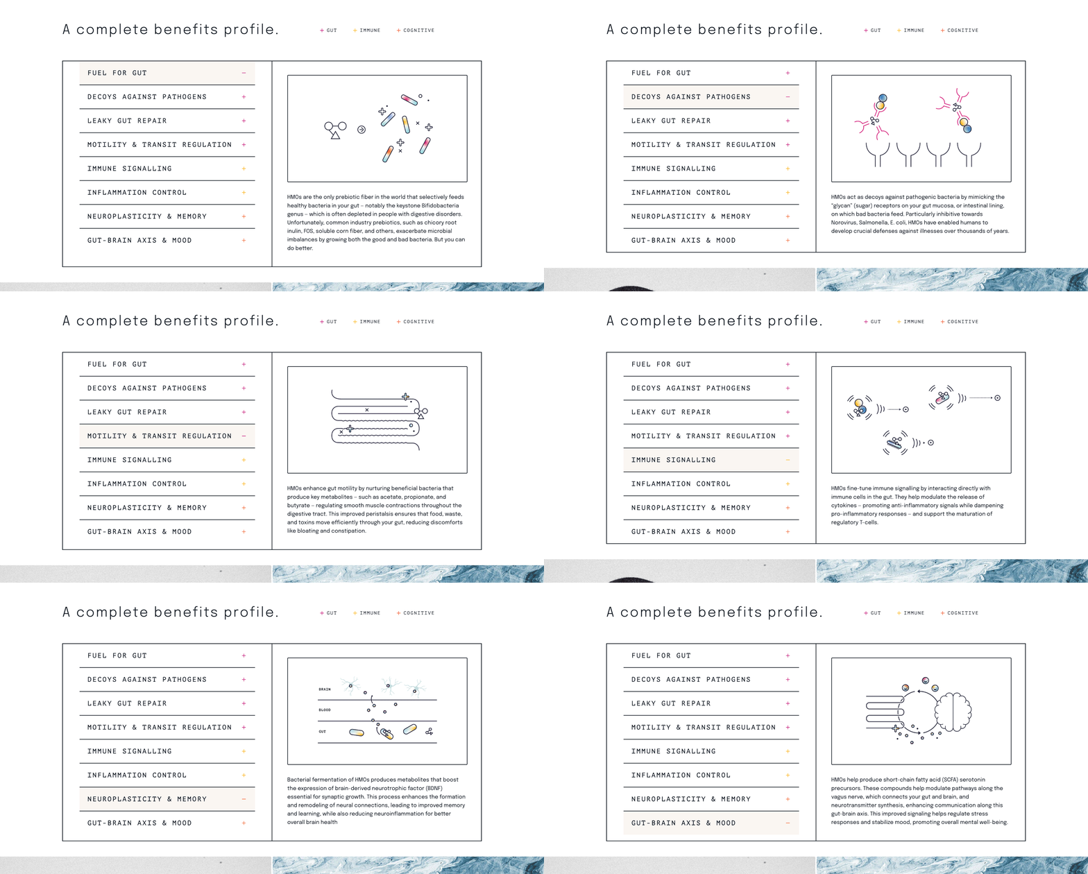
A graphic titled "A complete benefits profile" showing a list of benefits related to gut, immune, and cognitive health, with some marked positive. The right side features an illustration of capsules and molecular structures, with text explaining probiotics for gut health.
Six icons with text describing benefits of a product: human icon with 'Human Equivalent', chemical structure with 'Whole Body Benefits', network icon with 'Formulated with Doctors', circular arrow with 'Complete Bioavailability', test tube with 'One Scoop', and flag with 'Made in the USA'.
A black and white photo of a man holding his neck in pain with the word 'kēpos' overlaid. kepos human milk equivalent kepos brand design